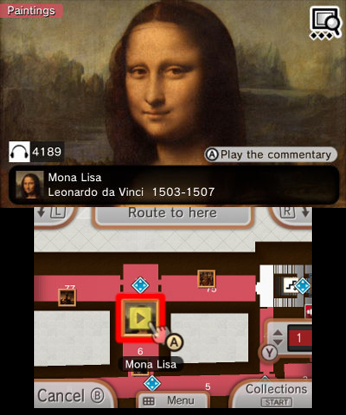
I chose this as one of my apps for this phase of the project since I believe it can give me valuable insight into how to present information for my intended audience. This application was made with all audiences in mind, but I believe that it can be used to give me a better idea of what kind of language and presentation to use for a project on something related to history. I can actually access this app for myself to use as a reference, but one of the shortcomings of this example is that a large amount of its UI elements are borrowed from the 3ds' own standardized UI, which will not be of much use to this project. However, the way that this app displays important information will still be valuable.
I can't really link to the original app, so here is a link to an article about it, as well as the source for the image
The sleek and modern design of this website are a good example to follow, and the way that it presents its topics will also be useful when covering the deeper topics of the seal, as previously discussed. With an emphasis on history, this will be a good reference for how to go about this. However, the design aspects of the site are not at all similar to the proposed project, so the aesthetics of this site will not be as much of an influence.